My Roles

UI/UX
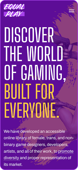
We split the homepage into the five categories that our platform offers: discoverability, timelines, suggestions, interviews, and miscellaneous.
The discover library follows layouts from popular streaming platforms like Twitch and Netflix to retain user familiarity.

Front-end
Developed the static landing page for landing page using HTML, CSS, and JavaScript.

Graphics
Designed two sets of icons, ten icons each, in two colour themes for gaming genres and roles in the industry.
Enriched the backgrounds with texture by designing four patterns.

Branding
Responsible for developing the color palette, designing the logo, patterns, and icons, as well as pairing fonts that project the concept of gaming.

Ad Campaign
Created a motion graphic teaser as part of the marketing.
Colour Palette
The goal was to add a third color to the palette to enhance the energetic atmosphere that fits esports and our competitive environment.
With energy as my focus, I decided to build the theme around the colors of the sun. The yellow was paired with a new reddish orange, while also utilizing radial gradients to further add to the concept.
Color Distribution
Primary Colour
Used for all purposes throughout the entire brand.
Primary Colour
Used for text, buttons, graphics, and backgrounds.
Secondary Colour
Used for buttons, backgrounds, and graphics.
Tertiary Colour
Used for backgrounds, dividers, and graphics.
Tertiary Colour
Used for backgrounds, dividers, and graphics.
Tertiary Colour
Used for backgrounds, dividers, and graphics.
Typography
Primary Font
Montserrat
ABCDEFGHIJKLMNOPQRSTUVWXYZ abcdefghijklmnopqrstuvwxyz 1234567890- Body Copy
- Buttons
- Table Headings
- Table Subheadings
- Table Body
Working with games of the sports genre, required displaying data visually almost constantly. Consequently, typography was the main challenge. The task was to find a family that offered an extensive selection of weights to ensure flexibility.
The answer was 'Montserrat', offering a myriad of different weights to work.
Wide and smooth characters paired well with the tall and condensed secondary font, as well as with our vibrant colours.
Secondary Font
Gobold Thin
ABCDEFGHIJKLMNOPQRSTUVWXYZ 1234567890- Numericals
- Headings
For headings on the website and our articles, we used 'Gobold'. A font with bold and tall characteristics aligned both with our theme and our competitive esports environment.
Logo
The script font, 'Cortado', perfectly captures the energy our brand drives for.
The letters exceed outside the confines of the equal sign, reflecting current female and non-binary gamers.
Icons
This set represents roles in the gaming industry, designed for the discovery page to filter through professionals.


This set represents video game genres, designed for the discovery page to filter through gaming titles.


Patterns
Our pattern designs were created with a mix of both orderly and rebellious attitude.


From graffiti covered walls that shout for change, to geometric symbols showing the vast world of gender.


There's always desktop!


