
Roles

UI/UX
Led UI/UX design for Digital Shovel's website and Minipod Manager, its proprietary software for remotely managing products, including animated icons and backgrounds, isometric product illustrations with feature callouts, and interactive "exploded view" animations revealing internal parts. Also designed a custom Slack emoji set.

Front-end
Built the company's static website using HTML, CSS, JavaScript, and GSAP, and designed an internal web app for PCB testing that auto-validated pass/fail results. Built responsive MJML email templates and added a Formspree contact form, the company's first web lead channel.

Animation
Created pseudo-3D product visualizations using pure CSS, removing the need for 3D rendering or video. Designed and animated After Effects product demo videos, covering assembly, delivery, airflow, concrete pouring, crane lifting, and busway installation for events and tradeshows.

Branding
Built a full design system, including components, icons, and logos, for Digital Shovel and its sister brands. Designed the Digital Shovel identity, a 5-year anniversary logo, the AWS Test Bench logo, and brand identities for Good Pocket Studios, BluAX, and The Sailing Beard.

Marketing
Designed ads, banners, flyers, signage, and slideshows for events and campaigns, plus product manuals, event menus, and tradeshow booth mockups. Handled product photography, managed all social media content, and built a business deck used to secure project funding.

Merchandise
Designed branded merchandise, including hats, hoodies, lanyards, mugs, pens, shaker bottles, socks, tote bags, and t-shirts, then managed procurement and manufacturing through China, sourcing suppliers and overseeing quality for every event wristband and item produced.
Colours
The goal was to create a bold, trustworthy identity that communicates technological expertise and reliability; the core values of a mining infrastructure company.
Pure White and Digital Blue take centre stage as the primary brand colour, conveying confidence and innovation.
The Blue Gray was added to serve as a contrasting separator between the white and blue for various subtle UI elements.
Color Distribution
Pure White
Used for backgrounds, text, and general layout.
Digital Blue
Used for calls-to-action, highlights, and notifications.
Blue Gray
Used for paragraph text, borders, and subtle backgrounds.
Typography
Primary Font
Inter
ABCDEFGHIJKLMNOPQRSTUVWXYZ abcdefghijklmnopqrstuvwxyz 1234567890- Body Copy
- Buttons
- Nav Labels
- Captions
- Data & Stats
Inter was chosen for its clean, highly legible forms that perform excellently at both large and small sizes — critical for a data-heavy platform displaying mining statistics and investment figures.
Its wide range of weights allows for precise typographic hierarchy without needing an additional typeface for body content.
The variable font format ensures optimal rendering across all screen sizes and resolutions.
Display Font
Right Grotesque
ABCDEFGHIJKLMNOPQRSTUVWXYZ 1234567890- Hero Headings
- Section Titles
- Banners
Right Grotesque, from PangramPangram, in its Black weight in uppercase, was selected for all display headings. Its bold, assertive character perfectly captures the strength and scale of industrial mining infrastructure.
Iconography
Sample of Purely Line Icons




























Sample of Line & Solid Icons
















UI/UX
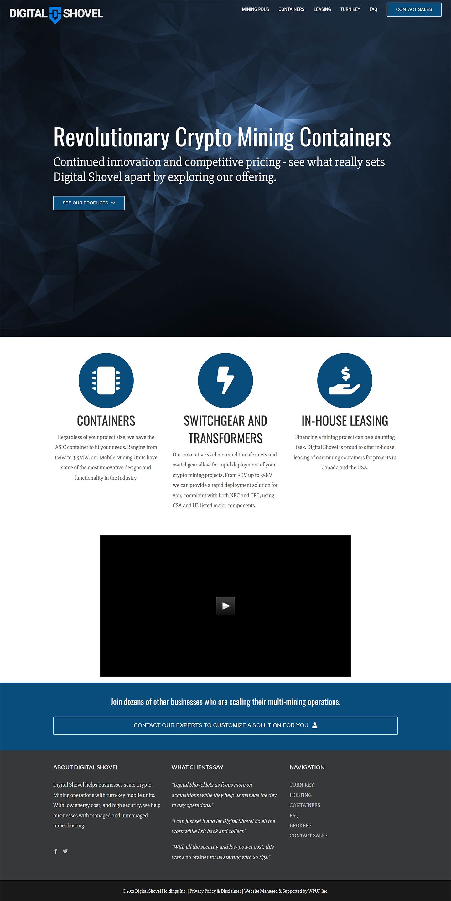
As the sole designer and front-end developer, my task was to redesign the entire website from the ground up. We aimed for a clean, modern, and accessible design across all devices.
Our goal for the website was to educate potential clients and hobbyists about the company's products, services, and connecting them with our sales & support team.
Using Figma, I created, scaled, and maintained a design system; including components, icons, and logos used across all Digital Shovel physical and digital products.
To breathe life into the system and website, I created highly performant pseudo-3D animations (using CSS), incorporated GSAP scroll-trigger animations, and designed SVG illustrations (isometric & flat) with interactive experiences.
In development, I opted for a static website built with HTML, CSS/SCSS, and JavaScript. This ensured fast load times, rapid development, instant deployment, and a seamless user experience.
- HTML
- CSS
- JavaScript
- SCSS
- GSAP
- VS Code
- Figma
- Illustrator
- Premiere Pro
As the main selling point of the company, it was paramount to showcase the product's features, specifications, and capabilities in a visually engaging and interactive manner.
My approach was to design an isometric illustration of the product and develop it with an interactive animated exploded view, highlighting its internal parts and features.
Additionally, I created product specifications, static/animated technical data, price ranges, modular configurations, and product manuals to inform users about its capabilities and performance.
All interactive and animated elements were designed in Adobe Illustrator, exported as SVGs, and animated with pure CSS (and minimal JavaScript), ensuring optimal performance and responsiveness across all devices.
- HTML
- CSS
- JavaScript
- SCSS
- VS Code
- Figma
- Illustrator
The goal was to maintain a consistent design language while highlighting the unique features of each product. In this example, an e-commerce functionality was implemented to allow users to purchase products directly from the website.
Secondary product pages offer photographic demonstrations, as an alternative to the animated exploded view, focusing on the realistic representation of the product and its features.
In the BluAX product page, I integrated our Shopify store for an all-in-one e-commerce experience, allowing users to add items to their cart and proceed to checkout seamlessly without redirects.
A custom-made branded product manual was also designed and made available for download, providing users with detailed information about the product's specifications, features, and usage instructions.
- HTML
- CSS
- JavaScript
- SCSS
- VS Code
- Figma
- Illustrator
- InDesign
Let's work together
If you like what you see, let's chat! I'm available for freelance work and full-time opportunities.
 Email Me